

TL;DR
Problem:
There has been a significant decline in reservations, and thus a great loss in revenue for the City Cycles business. Most patrons call to create a booking despite the online option readily available to them. This produces congestion on phone lines causing a frusturating experience for workers and users.
Solution:
A complete redesign of the City Cycles website was necessary to tackle the problem and create a streamlined online booking process.
Impact:
Creating a streamlined booking process has led to a range of benefits for both the business and users, including improved user experience, increased conversion rates, reduced abandonment rates, and lower operational costs. This has saved time and resources while driving an increase in revenue.
THE CHALLENGE
"I love that people are making reservations, but it's the fact they are calling in instead of using our website. It's clogging the phone line."
City Cycles has experienced a significant drop in online reservations over the pas year. The current process requires users to send an email requesting a reservation which in turn requires employees to call patrons to confirm said reservation. My challenge was relatively straightforward: identify the reasoning users pick up the phone instead of using the website and make a high fidelity prototype to address the problem.
"How might we get more City Cycle patrons to reserve bikes online?"
THE CLIENT
City Cycles is a local bike rental company, quaintly nestled in Riverside, California. It is the place for the latest bikes from mountain bikes to hybrid bikes and provides great local ride recommendation. Whatever one's expertise level and however one likes to ride, all are welcome to rent a bike and enjoy the great ride ahead.
RESEARCH & PLANNING
Combing through City Cycle's data analytics it was apparent they had experienced a sharp decline in online reservations. The starting point was to conduct usability tests to observe any pain points users were experiencing while attempting to book online.
Results revealed that users found the website difficult to navigate and "confusing". There were numerous instances of users desperately clicking anything to reach their goal of an online reservation. This was accompanied by looks of frustration, heavy sighs, and use of words such as "annoying".
UX Data Visualization Word Cloud

The most common words and feelings mentioned by City Cycles' users while making online reservations
Journey Map
To visualize what had been observed and expressed, I created a journey map to pinpoint how users felt during the reservation process and to identify key places where the City Cycles site could be improved in an effort to alleviate frustration.

In-Depth Interviews (IDI)
The next phase included conducting in-depth interviews, where participants emphasized the need for a swift and efficient reservation process, given their busy schedules with work and other commitments.
It became apparent that the mental model of users was misaligned with the design of City Cycles' site. Participants highlighted significant differences compared to platforms like OpenTable and Amazon, noting that the site was "challenging" and often felt "misleading".
"...this is supposed to book a reservation, but instead it opened my Outlook email program..." - IDI participant
These interviews provided valuable insights into the respondents' pain points and desires, leading to several important key takeaways.
Key Findings:
🔑 - Most patrons are busy individuals who do not want extra work or hassle outside of what they already have on their plates.
🔑 - Participants expressed having trouble locating the button to reserve a bike. Indicating that they expect a reservation button. Lack thereof led to many unintuitive clicks.
🔑 - Once they found the correct area to make a reservation to their surprise the button opened their default email application instead of prompted steps to reserve a bike.
🔑 - Most users did not want to send an email as a means of reservation. They felt "uneasy" this way. Thus, to calm the unsettling feeling many expressed they would simply call the number listed to have peace of mind their reservation was complete.
Personas
The data I collected and analyzed helped me craft 3 main personas embodying 3 different archetypes.


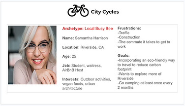
Many of my design decisions were centered around users like Samantha, who juggles multiple jobs and needs an efficient, seamless experience. By designing with Samantha in mind, I aimed to create a solution that would also resonate with users like Asher, who is vacationing, and Sameer, a retired school teacher enjoying a slower-paced lifestyle.
In other words: making Samantha my primary persona allowed me to address the needs of all three.
DESIGNING THE SOLUTION
User Flow
Based on my research, I hypothesized that a streamlined, simple user flow would be essential for patrons to make reservations without frustration.
I proposed designing a system where users could make reservations and receive immediate confirmation, addressing the confusion and annoyance caused by the current process. At present, users must make reservations via email, prompting staff to follow up with a phone call for confirmation.
By simplifying this workflow, I believe online reservations would increase, freeing up phone lines for other tasks and potentially driving more business. Additionally, this improvement could boost site retention, encouraging users to explore other areas of the City Cycles website and discover more of what it has to offer.

Early Sketches
I created multiple sketches exploring different iterations of City Cycles' navigation, homepage, reservation process, and blog section, which eventually evolved into the About page.

1st ideation of new reservation process

Early homepage concepts with illustration and reservation at forefront

Navigation ideation with hamburger menu and hotdog style menu

Initial blog layouts, which soon became the backbone of the about page
I soon settled on homepage that had one hero photo and multiple reservation buttons. Pain points demonstrated that users did not know how to get to the reservation button or even where it was -- this would eradicate that problem.
Additionally, including breadcrumbs at the top of each page would alleviate confusion that users experienced in regards to where they were in the website and how many more steps were ahead.

Final homepage sketch with 2 reservation buttons and sticky contact information footer

Breadcrumb trail at top of page in second step of reservation process
SOLUTIONS
I focused on designing and prototyping the following solutions to simplify the reservation process and alleviate customer frustration:
🧪 - Adding a reservation button directly in the site navigation that stands out and can be accessed from any page.
🧪 - Including a large call to action on the homepage that leads users directly to the reservation process.
🧪 - Ability to select the type of bike, date of pick up, date of drop off, and make direct payment on website.
🧪 - Adding breadcrumbs at the top of the page during the reservation process to relieve any anxiety regarding the amount of steps left.
🧪 - Creating a sticky header and footer so one can always return home, visit another page, make a reservation, or collect contact information at anytime during experience.
🧪 - Decreasing reservation process to 3 steps.
🧪 - Including a confirmation page that provides all the information users expressed they looked for which simultaneously addressed pain points with reference to frustration of "not knowing what to do next".
Hi-Fi Prototype
Homepage

Hero image and nav accompanied with two big call to actions

Preview of bikes with option to click and learn more

Subscription section to continue to keep reservations, news, and deals online instead of via phone.
Reservation Process

Reservation page with fill in the blank sections for users to enter personal information.


Calendars for user to easily select pick up/drop off date along with desired time.

Users can pick desired bike and quantity along with descriptions of each bike to help with decision.

On the left, users can see the bike(s) selected along with details of future reservation. On the right, is all payment information, cancellation policy, and policy details.

Confirmation page with details participants expressed they expected to see at end of reservation process.
CONCLUSION
If I Had More Time...
📍 I would have conducted usability tests post hi-fi prototype creation. Usability tests give great insight on further iterations of a product and keep the users' experience at the forefront of each project.
📍 I would have performed a heuristic evaluation of the original City Cycles website. To be able to gather violations in conjunction with users pain points and desires would have been ideal.